The four colours
Open My Ring Builder → your configurator → 4. Theme. It sits between Pricing and Publish, so the colours are settled before you copy the embed snippet.
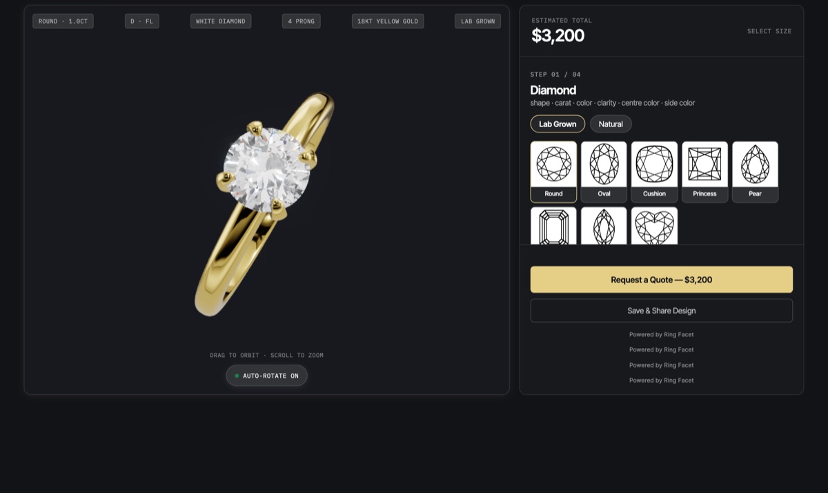
- Embed background — the area around the whole builder, which shows in the margins on a wide screen.
- 3D ring background — what the ring is rendered against. The model itself is transparent, so this is the backdrop behind it.
- Options background — the panel holding the price, the options and the button.
- Buttons & selection — the Add to cart or Request a quote button, and the outline on whichever option the shopper has chosen.
There is deliberately no separate text colour. A background and a text colour set independently can be set to an unreadable pair, and the shopper is the one who pays for it.
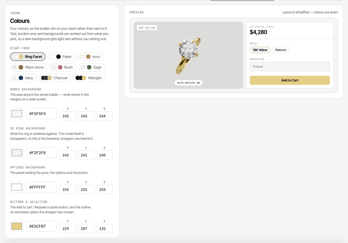
Start from a preset
Nine palettes are built in, light to dark: Ring Facet, Paper, Ivory, Warm stone, Blush, Sage, Navy, Charcoal and Midnight. A preset is a starting point, not a lock — every one is four ordinary colours you can then move.
Each palette is checked so the text it produces on its own backgrounds, cards and inset fields clears the WCAG AA contrast ratio, and so the button is distinguishable from the panel it sits on.
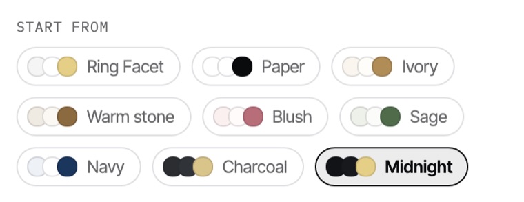
Enter an exact brand colour
Every colour takes a value three ways, and they all write the same thing:
- The swatch opens your operating system colour picker.
- The hex box takes a value pasted from a brand guide —
#0B3D2Eor0B3D2E, three digits or six. - The R/G/B boxes take the numbers as a design tool reports them.
The hex box commits when you leave the field or press Enter, so a half-typed value is never read as a three-digit colour mid-word.
Readability is not left to chance
Once you pick a background, the builder derives everything that sits on it: the text, the borders, the card surfaces and the inset fields. For each surface it takes whichever of near-black or white reads better against that background, measured by contrast ratio rather than guessed from how light the colour looks — a saturated mid blue is not as light as it appears.
Derived card and well surfaces are then nudged until they clear the WCAG AA ratio for body text. A dark options panel gets light text, light borders and raised cards, and you do not have to set any of it.
One thing stays fixed on purpose: the tiles behind the diamond shape and setting thumbnails. Those are renders with a transparent background, drawn for a light plate, so tinting the tile would erase the artwork. The card around each tile follows your theme; the tile itself does not.
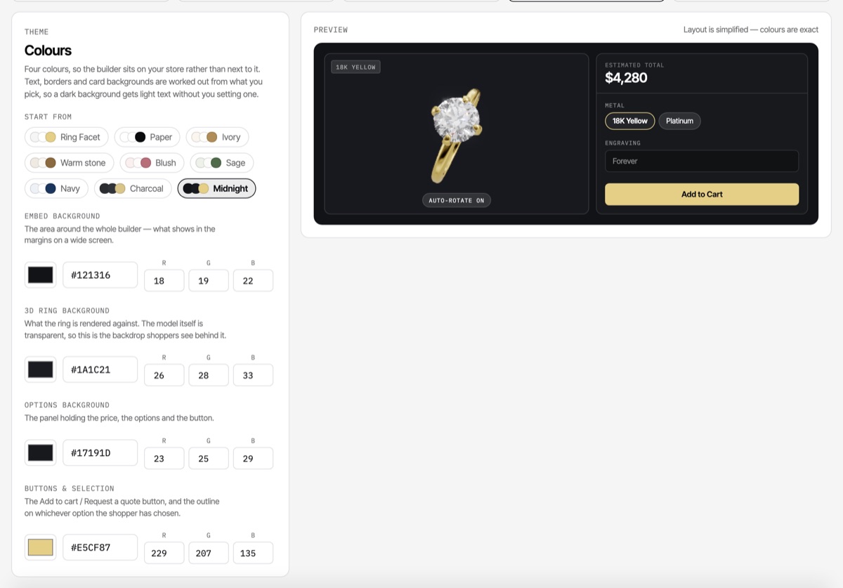
What shoppers see
The preview in the Theme step is a scale model of the embed — the same three surfaces and the same derived text colours — so a combination that makes the price hard to read shows up there rather than on your storefront. Save the configurator, then use Open preview on the Publish step to see the real builder at full size.
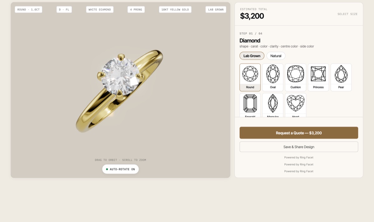
Where the theme applies
The theme travels with the configurator, not with the page it is pasted into. It applies anywhere the embed snippet is used — a Shopify custom liquid section, a WooCommerce page, or any site that accepts an HTML embed — and to the shared design links your shoppers open.
The Shopify theme block is the exception. That version has no options panel of its own by design: it renders directly onto your theme’s own background so it inherits your store’s styling. The button colour applies there; the three backgrounds have nothing to sit on.
Colours are saved per configurator. If you run more than one builder, each carries its own theme, and changing one leaves the others alone. Set up a configurator or configure pricing.